Intention Psychotherapy

Research
Client Consultation
The previous version of this website was designed a number of years ago and the client felt that it was time for an update. I agreed, some of the design decisions had been made with a certain styling in mind that, while perhaps eye-catching, was not particularly user friendly. Large images of lights dominated many of the pages and contact forms were dotted around each page, the website on a macro level seemed to lack a clear flow, a natural guidance for the user to get the information they need and then book an appointment
As the first step in the design process I had a meeting with the client and we discussed what information was most important to be presented to the user, what kind of feeling did the website need to represent? We settled on an understanding of a site that was clean and clear, but also classy, sophisticated, and existential.
Competitive Benchmark
Before anything else, I decided to assess the landscape of other counsellors' websites. This was an interesting endeavour as many counselling sites were somewhat dated and the visual motifs they used (flowers, nature, pebbles, etc…) my client was not interested in. Enlarging the comparison criteria led me to viewing the websites of psychologists and physiotherapists, many of whom had more professional looking web design.
These were certainly a beneficial comparison point, giving an idea of effective ways to structure the information presented to the user. While their visual styling was often too cold and clinical looking for my clients tastes, it was helpful to know the order in which information was given.
My primary concern was what does the user need to know immediately? What level of understanding of counselling and psychotherapy is the user likely to have? What kind of information will grab the user and prompt them to read more? And finally what will get them to take the final step of getting in touch to book an appointment?
Usability Testing
After assessing the competitive landscape, I conducted a series of usability tests on both the previous Intention website and a competitors website that I felt exhibited many exemplary qualities in their information architecture. The results were fairly clear, while the users generally liked the visual styling of the original Intention site, the user flow from finding out information to booking an appointment needed refining. From the home screen, too many clicks were needed to access the essential information potential users were looking for.
A strong point on the competitors website was the use of images of the therapist early on in the sites flow. It was shown in usability testing that seeing the therapist early aided potential clients in making a decision on if the therapist was right for them. I was also made apparent that there should be an introductory section on the home screen that detailed what exactly counselling is, something that must not be assumed that every prospective client would know already.
Analysis
Key issues
-
Too many screens with little information present.
-
Too many clicks to navigate to useful information.
-
Images dominate sites layout.
-
No clear user flow defined in the sites architecture.
-
Contact forms placed sporadically
-
Images of therapist too deep within the architecture.
Positives
-
Users liked modern styling of the site.
-
Therapist's pictures were warm and understanding.
-
Text content well written and approachable.
Plan of action
-
Reduce number of pages.
-
Condense information spread.
-
Present most important information first.
-
Guide user from brief info to detailed info to contact.
-
Keep brand image while reducing number of repeated images.
-
Make site helpful for users both knowledgeable and unknowledgeable about therapy.

Persona - Alan Richards
Age: 28
Occupation: Accountant
Location: Sheffield
Bio
Alan is a single young man who has not been to therapy before. He has been considering therapy recently but isn't sure where to look and would like to know more about how therapy works.
Needs
-
Clear concise information on what therapy is
-
An understanding of how a counsellor will work with him
-
To be shown the counsellor can help with the issues he is dealing with
-
To be able to contact the counsellor easily if he wishes
Key issues
-
Too many screens with little information present.
-
Too many clicks to navigate to useful information.
-
Images dominate sites layout.
-
No clear user flow defined in the sites architecture.
-
Contact forms placed sporadically
-
Images of therapist too deep within the architecture.
Positives
-
Users liked modern styling of the site.
-
Therapist's pictures were warm and understanding.
-
Text content well written and approachable.
Plan of action
-
Reduce number of pages.
-
Condense information spread.
-
Present most important information first.
-
Guide user from brief info to detailed info to contact.
-
Keep brand image while reducing number of repeated images.
-
Make site helpful for users both knowledgeable and unknowledgeable about therapy.
Design
Sketches
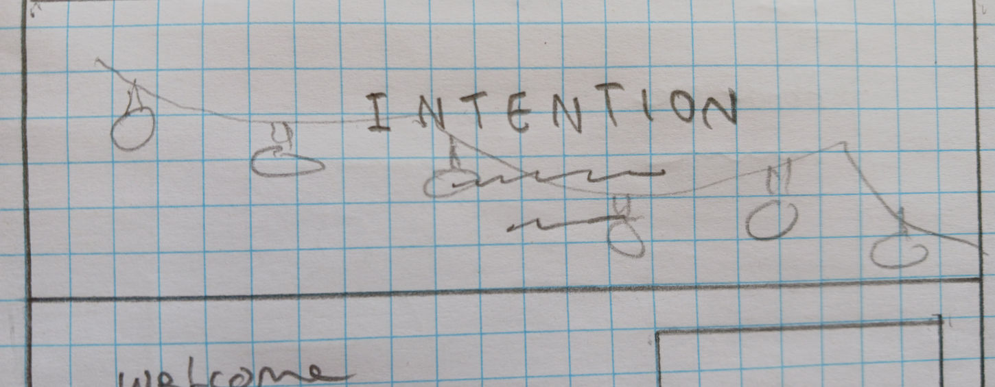
Based on the research I had conducted, it was clear to me how I wanted to information to be structured on the site. Firstly the most important information users may need must be present on the first screen they see. This information had to include: A short description of what counselling is, a clear picture of the therapist, a condensed description of the therapists approach to counselling and the issues they work with, and a clear call to action button leading to a contact form.
Each piece of information should have a clear pathway to find out more and all booking buttons should lead to one clear, easy to understand form to get in touch.
Wireframes

Second Consultation
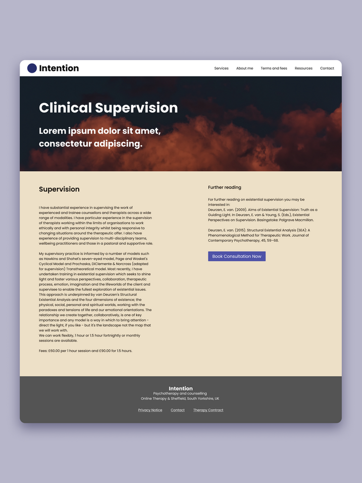
After creating the overall layout of the site I had another consultation with the client to make final decisions on the colour palette and branding. Initially it was important to the client to keep the festoon lighting theme from the previous site and to model the palette around that theme.
After some discussion we decided to test out alternate branding ideas that may represent the feeling the site was intended to evoke. After deliberation it was decided to go with a theming of the moon and clouds, to represent one's place on the earth.
Once the main branding was decided, I designed the colour palette accordingly, making sure that the client was also happy with it representing her brand digitally.
Final Prototype


